Read
Minimalistic Website Design
Minimalistic Website Design
“Less is more”.
We’ve heard it, more or less, throughout our entire lives. It is a phrase used to suggest that the less that something might be used, the bigger the impact it could potentially have on the end result. Some might argue that it describes the concept of ‘minimalism’ in a very basic format.
Minimalism can be used to describe a variety of things: food, art, music and even buildings! It can be an incredibly powerful method of conveying a certain mood or feeling, or it can be an extremely aesthetically pleasing design model.
There are many benefits to minimalism, especially when it comes to branding and website design. Aside from creating stunning visuals, the clutter-free designs will allow users to find exactly what they’re looking for, saving both time and effort whilst making them much more likely to return in the future.
Minimalist designs can even be implemented to subliminally highlight something of interest, making a page visitor more likely to click on it. The theory behind this is that you are taking the focus away from unnecessary or crowding designs, pinpointing an exact area of your web page that you’d like someone to visit.
It goes without saying that minimalism can be used to create stunning websites that really showcase your brand and vision. Here, we’ll look at some of the best practices to follow if you’d like to create your own show-stopping minimalist website designs:
Stick to a colour scheme
One design aspect that most minimalist website designers will incorporate is a simple colour scheme. Designers will typically stick to a palette made up of two or three colours to create everything from the fonts to the banners and backgrounds.
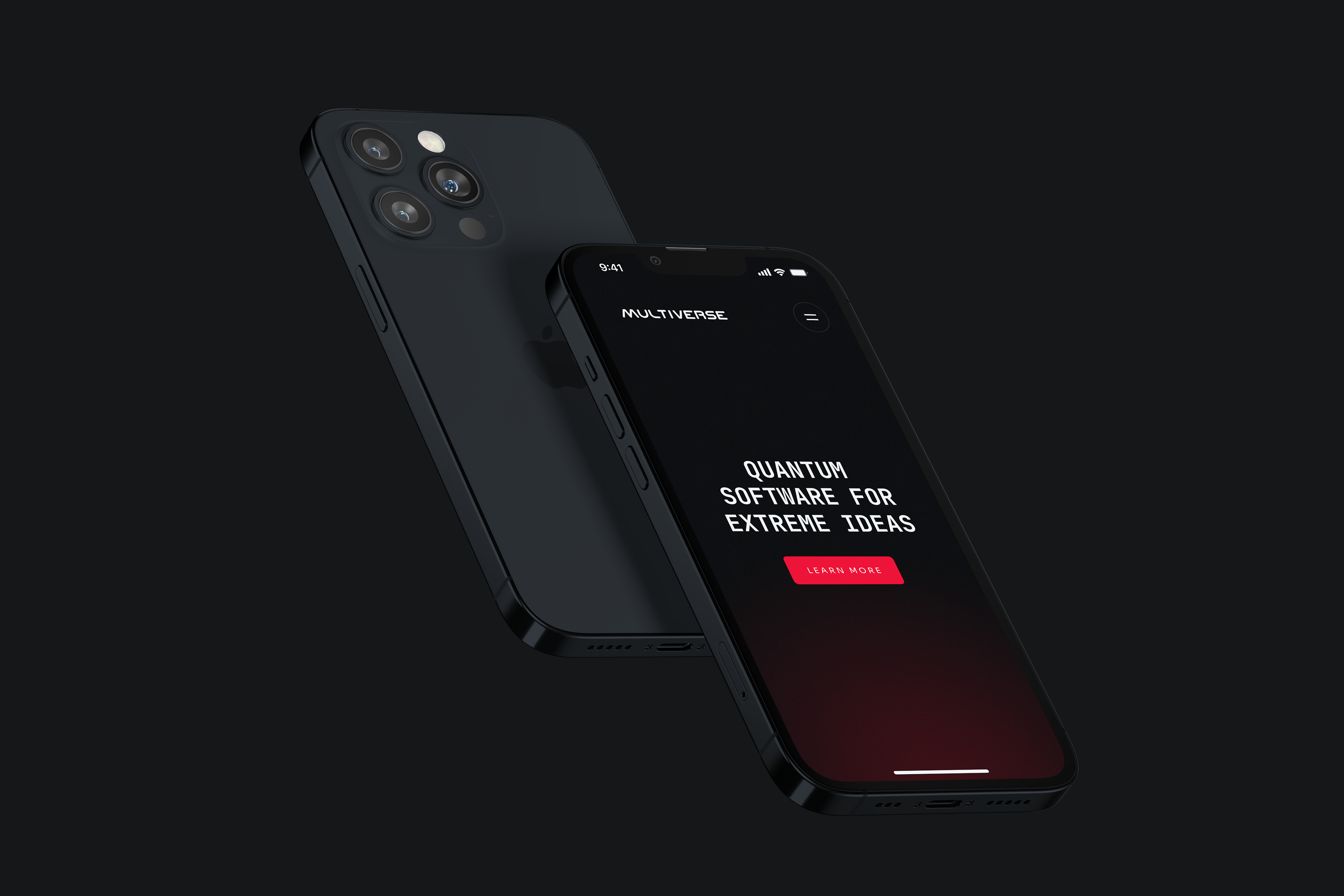
Take, for example, Hoooman Studio’s website. We’ve have used a simple white background with a capitalised black sans-serif font - this creates an easy to follow yet visually attractive design that doesn’t draw unwanted focus to any unnecessary features.
Websites designed by our studio are is not cluttered, with well-organised visual elements that follow a centred pattern - users know exactly where to go for whatever they might need!
A web page does not necessarily need to use ‘monotone’ or ‘grayscale’ colours; bright colours can be just as effective, usually creating an instantly noticeable or memorable brand.
The colours you choose to use should clash, as this can make it difficult to look at or process, and should relate closely to your brand design.
Single page navigation
Another staple of minimalist web design is using a ‘single-page navigation’ set up, which makes use of any necessary links being listed on every single page.
Our websites have been designed to provide optimal navigation; every page can be accessed wherever you might be on the website. All of the links are listed noticeably at the top of each page, which means users won’t need to fight through a list of convoluted or messy links.
Negative space
Negative space, or whitespace, is a term used to describe ‘empty’ areas of a website. It can be a powerful tool when used correctly, creating a sense of elegance across the web page.
Negative space is a staple of minimalist design, used by web developers and artists alike to create striking, bold designs.
Visuals
If you’re building a minimalist website, the visuals you use should also have a minimalistic quality. If you use cluttered or messy images, you risk ruining the overall view or even the structure of the website.
Images and visuals will likely be a key part of your website, as these have been proven to engage with users more than text-based posts. In order to achieve a minimalistic feel, your visuals need to be carefully picked to really represent the mood or feeling you’re trying to achieve.
Less is more
Simplify your designs again and again, to the point where the colour schemes, designs and feelings outweigh the displayed information. Use text sparingly, relying heavily on visuals, as the text is one of the easiest ways to clutter a website.
Minimalism should invoke a feeling above anything else. Use creative designs and layouts to your advantage to really make an impact, and let the designs speak for themselves.
Recent articles
The Complete Web Design Process: From Onboarding to Launch with Hoooman
April 03, 2023
4 minute read
Image Alt Tags: A Gen-Z Guide
March 01, 2023
2 minute read
Stay Ahead of the Game: 14 E-commerce Trends to Watch for in 2023
January 23, 2023
2 minute read
The Advantages of a Custom CMS, Tailoring Your Website to Your Unique Business Needs
January 20, 2023
2 minute read
Minimalistic Website Design
November 08, 2018
5 minute read