Read
How to design a unique business card?
How to design a unique business card?
Business cards are the swiss army knife of the business world! An absolutely essential tool for your company’s growth; business cards allow you to show off not only your personality but how your creative and unique business can benefit others.
Your business card isn’t just a hub for your contact information: it’s an extension of your brand itself - a physical representation of your company and your branding. Business cards are a powerful call to action, and when used correctly, they can net you great clients for life.
The problem is that it’s too easy to make a decidedly ‘bad’ business card - many people don’t actually know what makes a professional quality, engaging design. When your business card is essentially an invitation for somebody to use your product or service over another, you need to make sure that it represents the high quality of work that you know you can deliver.
Don’t worry - here, we’ll break down all of the tips and tricks that you’ll need to create a show-stopping business card that’s guaranteed to bring you more customers!
Consider Your Brand
One of the most important things to consider when you’re creating your business card is how you plan to integrate your brand or concept into the design. Your business card shouldn’t just provide a fast point of contact for your customers, but should also set you apart from your competition.
If your design is unique it is much more likely that your business card will be the first that gets pulled out of the pile.
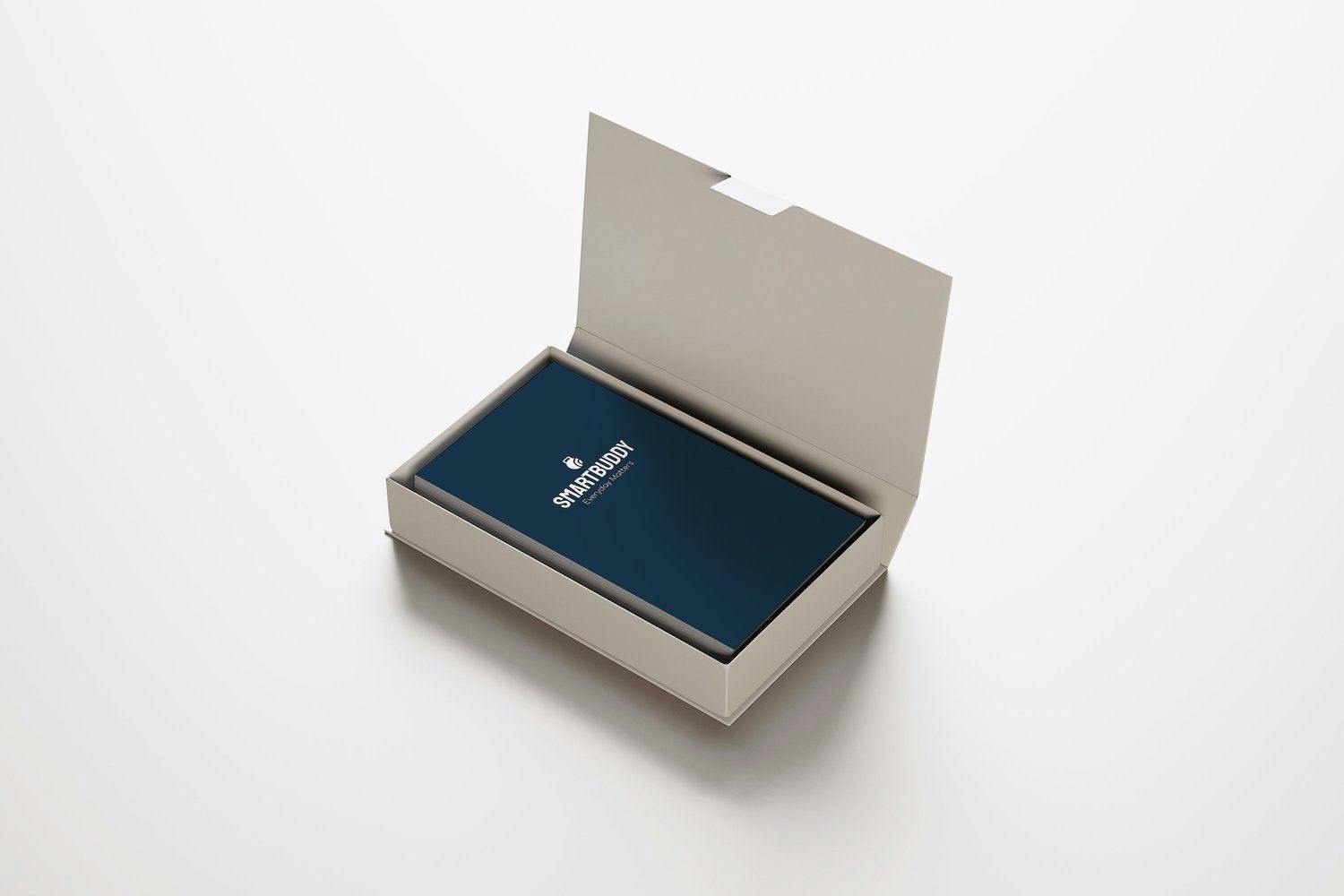
Take, for example, SmartBuddy’s business card.

Bold white text on a dark navy background. A clear, defined log that tells you exactly what to expect. A beautiful colour scheme, and no cluttered information.
The logo itself shows a dumbbell, which suggests a fitness-focused brand, with the bottom corner of the weight cut to replicate the ‘Wi-Fi’ symbol, reminding the customer that SmartBuddy will help the customer stay not only healthy and focused, but connected too.
Less is more
Business cards do not need to be overly complex: this can make it a lot harder for customers to find the information they might need, such as a phone number or an email address.
You should focus on keeping your designs simple, as less really is more. Complicated designs generally look messy, or might not make a great first impression - a unique and simple design will show startups, online stores and small businesses that you are organised, professional and value your brand’s image.
A simple design will also allow you to utilise the marvellous ‘power of summary’, directing the viewer’s attention straight to what’s important: how they can get in touch.
Make it memorable
It goes without saying that your design should be a memorable one. Whether you’re using a creative logo, layout or slogan, one thing that you should always focus on is making it memorable!
Picture this: a new startup is staring at a pile of business cards, unsure who is going to provide the best service. Your business card INSTANTLY springs to mind, which is fantastic! They won’t need to spend time trying to pick out the best card - they already know!
One unique way that you can make a memorable business card that makes a great first impression is by adding finishing textures that complement the service you provide.
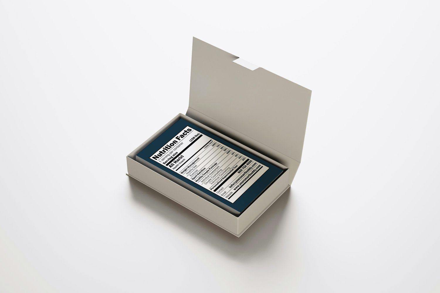
Hoo Man studio have designed an engaging, easy to follow ‘Nutrition Facts’ business card, with all of the information collected and presented as if it were a nutrition label - this really shows off an out-of-the-box design strategy that instantly draws a professional connection whilst remaining relevant to the brand!

Stick to a colour scheme
Think of a world-famous brand. What’s the first thing you think of?
Maybe it’s the bright yellow lettering of the McDonald’s sign. Perhaps it’s the sleek red-white curves of the Coca-Cola logo, or the bold orange-white text of the all-too-familiar Fed-Ex. Regardless of what brand you think of, their colour scheme will play a hugely important role in how memorable that brand is.
When designing your business card, you should always aim to implement your brand colour palette. Association is an incredibly powerful tool, so by using a strong colour scheme in your design you may be subconsciously pushing a potential customer towards your brand.
Try not to use clashing colours - instead, go for two-three colours that compliment each other!
Wrapping up
So, there you have it: a tried and tested guide, teaching you how to make a professional, creative and unique business card.
With a quality, minimalist brand design, you’ll be able to start working with reliable clients, regardless of whether you’re an upcoming small business, online store or the next big startup.
What are you waiting for? You’ve got a design to finish.
Recent articles
The Complete Web Design Process: From Onboarding to Launch with Hoooman
April 03, 2023
4 minute read
Image Alt Tags: A Gen-Z Guide
March 01, 2023
2 minute read
Stay Ahead of the Game: 14 E-commerce Trends to Watch for in 2023
January 23, 2023
2 minute read
The Advantages of a Custom CMS, Tailoring Your Website to Your Unique Business Needs
January 20, 2023
2 minute read
Minimalistic Website Design
November 08, 2018
5 minute read